Wayfinding
Many of our products relating to doors are designed to dissuade residents in Memory Care from the exit doors, as even the sight of a door with pushbar can be a cue to leave.
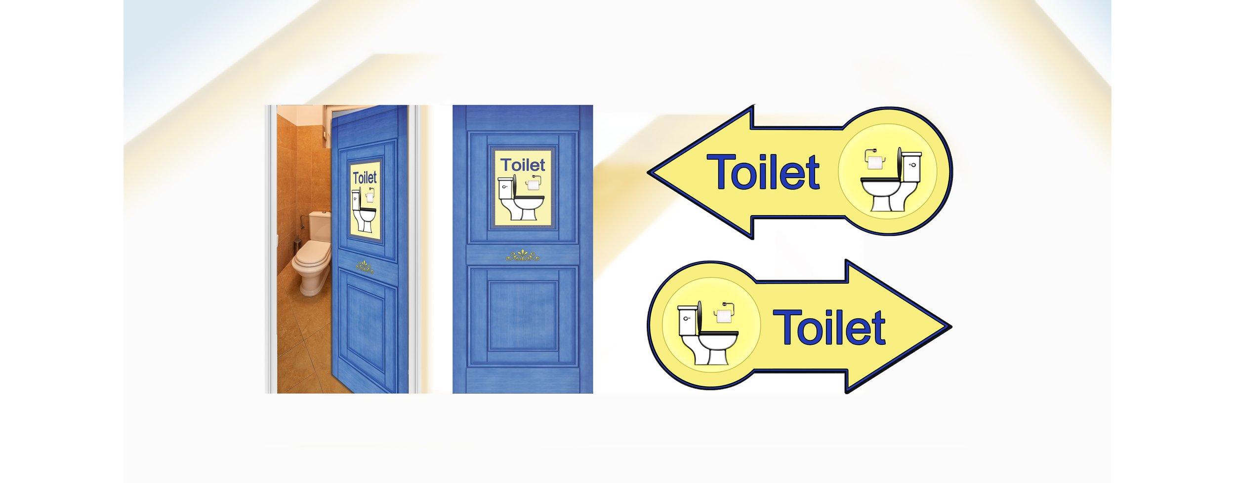
There are doors however into which we want to invite residents, doors that need to be obvious, such as the all important one leading to toilet and washing facilities.
In addition
Self-adhesive vinyl signage adheres directly to wall. Not suitable for wallpapered walls or any textured surface.
Signage in a hallway that contains both wording and image is helpful in directing a resident to that important door. One may think this is all too “graphic” for the everyday language we use, however, for a person struggle with cognitive impairment needs explicit messaging. In other words, it is necessary to “tell it like it is” and leave no doubt. For some residents, the picture is the most important as they may have reverted to a language from their native country which is not english. As for the yellow background, yellow is thought to be the most “luminous” of all the colours and provides the best contrast for wording and images. As many people living with dementia have difficulty perceiving signage that lacks contrast, this is an important feature.
For Areas that are “Dead Ends”
*Sold only as part of End-of-hall or Exit Diversion projects
Self-adhesive vinyl signage adheres directly to wall. Not suitable for wallpapered walls or any textured surface.
We have seen a lot of frustration in our years in Memory Care communities, when a hallway or other area ends without an obvious way forward for the resident in care. We have often been asked “where do I go now”?
“Dead ends” sometimes cause a resident to wait by an exit door for it to open from the other side. Other times, to make an unwanted incursion into another resident’s room. Clear signage can help direct a resident back towards a communal area or to continue their walk in the reverse direction.
This complete door wrap is designed for a door (without a glued-on lower protective panel) as you see here.
Resident’s toilet clearly designated as shown beside Exit Diversions (single exit door with window side panel on the bright backdrop of the colour scheme for the Butterfly Model of care for dementia.
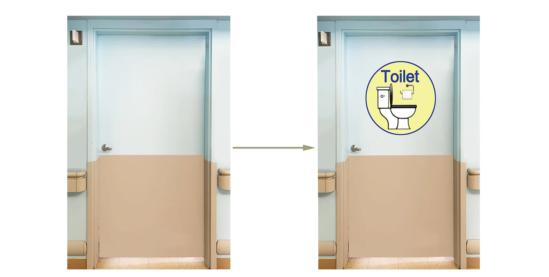
Our circular Toilet sign is also very effective and is an alternative for Care Homes with a lower door protective panel.


